Tag Archives: new artists

From The Slush Pile: Summer Finds

You know I’m busy at work when instead of going through art samples with my morning coffee, they pile up on my desk.  Today, I finally took lunch to sort through a few.  Check out some exciting new finds that came in lately!

Casey Uhelski / For pet lovers (like me!), this SCAD grad has mastered the expressions of adorable dogs, cats and bunnies.

Victoria Jamieson / Victoria’s anthropomorphic characters have landed her a two-book gig with Dial (part of the Penguin family) in 2012/2013.  In the meantime, I think her revisiting of Ramona Quimby is spot-on.

David C. Gardiner / This image might suggest that David and I are cut from the same cloth, stylistically, but his Flying Dog Studio also produces everything from fairly realistic older characters to animations.

Caitlin B. Alexander / This Austin-based illustrator’s folksy-yet-modern style looks mostly editorial, for now… but wouldn’t it make a charming children’s book?

Veronica Chen / I was intrigued by her intricate black-and-white patternwork, but her color piece Chameleon City just begs for a story to be told.

Jillian Nickell / This quirky, vintage-inspired vignette was fascinating enough to lead me to her website, where there’s a great series of pieces based on The Borrowers, and more. I can picture her style being perfect in the right book for older readers!

Best Of Student Work 2011 – Part 1: SVA MFA Thesis Show

May means graduation time, and New York City is filled with student exhibitions and senior work on display for the world to hire.  So for the next few weeks, I’ll be snooping several art schools’ openings for new and inspiring illustrators, and bringing the best of the best right here to the blog.

I started with the School of Visual Arts’ MFA Thesis exhibition last night!  I’d highly recommend trekking to Chelsea for both design and illustration. Details below:

Visual Arts Gallery / 601 W 26th Street, 15th floor

April 29-May 14, 2011 / Mon-Sat, 10 am – 6 pm

All the student work was of exceptional quality (they ARE MFAs, after all), but here were my Top 5:

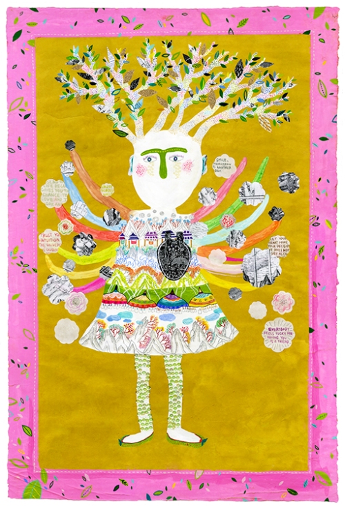
1. Hye Su / Looking at Hye Su’s body of work is like stepping into a completely different universe.  Her mastery of a range of mediums (from embroidery, to zines/books, to 3-dimensional objects) remain entirely consistent – everything is shown through her very unique lens.  I couldn’t get enough of her wild and wonderful characters!

2.  Lisa Anchin / Of anyone else at the show, it was Lisa who was made for children’s books.  I was impressed how prolific and professional her work was – at least 4 or 5 book dummies ready to go, and full of adorable characters and dynamic compositions to boot.  Lucky for me, guess which Penguin imprint she’ll be interning at this summer?  That’s right… we’re very excited to have her!

3.  Philip Cheaney / How excited was I to see someone who created a fully-formed eBook app?!  I was really impressed with (read: jealous of) its smooth, polished look on the iPad.  His bold, graphic lines and color sensibility are perfect for medieval subjects like Tristan & Iseult.  Check out his animations here.

4.  Pimlada Phyapradit / Pimlada’s another artist with a very different way of approaching characters.  Her broken-down toys are sweet and childlike, but with a touch of melancholy.  I’m most impressed, though, with the muted pastel tones throughout her book – it really adds to the wood textures and her drawing style overall.

5.  Jungyeon Roh / Jungyeon’s silkscreen prints are seriously, seriously stunning.  The illustrations for her book, Hot (featured in the show), somehow strike a balance between whimsical color and powerful content, with a bonus of beautiful hand-drawn type.  I wouldn’t be surprised if she continues to garner major awards and editorial publications in the future!

SCBWI 2011: Stand-Out Illustrators!

This past weekend was the annual SCBWI Winter Conference, a 3-day event, packed with speakers, panels and workshops, that brings authors and illustrators to Midtown from across the country.  I’ve always wanted to go, and finally had the chance to attend the Illustrators’ Intensive by begging offering to help out a bit.

Friday was all about children’s books and new media (more on that later), but one of the most fun perks was getting to see the showcase of illustrators that was set up for judging and industry viewing.  As I tried to have fun and not to get overwhelmed by the VIP cocktails and networking, I managed to grab a few cards of my favorites.

I was pleased, but not surprised, that Leeza Hernandez (above) won the Grand Prize at the showcase. She’s super talented, and has a friendly, approachable personality to boot. But I’ve been following her work for some time, so while she deserves much congratulations, she doesn’t count on my list of “new discoveries” . . .

1. Andrea Offermann /  It was so lovely to meet German illustrator Andrea Offermann, whose rich, detailed porfolio is breathtaking.  Her work is perfect for older, middle-grade readers – book covers, black and white interiors, graphic novels.  I won’t be surprised to see her art all over the shelves!

2. You Byun / Aww, how sweet are those characters’ faces?  And look at the lush range of texture!  And warmth of light!  When it comes to creating worlds, You Byun has it down.  And I’m seriously gushing over every single one.

3. Greg Pizzoli / Okay, this guy’s silkscreen prints are just too freaking cool. I’ve got major jealousy looking at his 32-page promotional zine, C’mon, Go!, and the hand-bound editions of his books are fine art, but could so easily be commercially reproduced.  His website is most effective too, with a fun, in-depth look at his process.

4. R.S. Posnak / We designers made a beeline for R.S.’s Oliver Jeffers-esque line work and letterpress business cards (we’re too predictable).  Turns out, she’s also a designer, and has an online portfolio with a healthy mix of sleek commerical projects (for adults) and vintage curios.  Hello, animal dioramas!

5. Brian Gerrity / On the other end of the spectrum, Brian Gerrity’s work is made for kids.  Fun, bubbly characters, with a smooth digital look, are perfect for little ones.  And what a whimsical sense of pattern… you can look back at the picture again and again, and still find something new.

Illustration Week Round-Up

Bright-eyed and bushy-tailed – just like Ian Falconer’s Squirrel Seeks Chipmunk by David Sedaris.

Phew, what an exciting week we had on the blog for the 1st annual Illustration Week! To be honest, when I first put out the idea, I completely underestimated what an amazing response I’d receive from my talented fellow illustrators, and what a positive reception the entire idea would get on the internet.  Thanks to everyone for tuning in!

I’d like to thank everyone who got the word out last week about our New Artist Showcase, starting with kids-lit blog gurus Betsy Bird at School Library Journal’s Fuse #8 blog, and Jules over at Seven Impossible Things Before Breakfast for their fantastic write-ups!  Also a big thanks to featured artists Chris Harrington, Heather Sisson, and Daniel K. Harlow for the nice words on their own blogs.

I also can’t forget to mention that numerous people gave this blog event a shout-out on Twitter… so if you have Twitter, go on over and follow them, please!  Thanks to my publisher Nancy Paulsen @nancyrosep, advisor for emerging illustrators Jon Woodward of Zero2Illo @jonwoodward, top-notch illustration blog A Journey Round My Skull @roundmyskull, starchitect/roommate Adrielle Emilia @adrielleemilia, alma mater Pratt Career Services @PrattCareer, too-hilarious writer/blogger/badger Merit Badger @meritblog, and one of the best children’s book news bloggers in the biz, Travis at 100 Scope Notes @100scopenotes.

Did I miss anyone . . .?  Let me know!

While I don’t think I could ever keep up with posting daily, I will continue to feature up-and-coming illustrators. I personally learned a lot from the artists who were interviewed, and I can’t wait to expand it more.  So if you are/know someone who would be great for the New Artist Showcase, do let me know!

In the meantime, here’s a round-up of all the artists of this week (in case you missed any), and don’t forget to check out today’s finale illustrator, Chris Harrington!

Danny Quirk: website / blog

Kevin Stanton: website / blog

Heather Sisson: website / blog

Dan Masso: website / twitter

Dan Harlow: website

Christee Curran: interview

Chris Mulvey: website

Alexander Doig: website

Shaina Koval-Kim: website

Alexa Macfarlane: blog

Chris Harrington: blog / youtube

New Artist Showcase: Kevin Stanton

This is a post in a series of interviews featuring up-and-coming illustrators, in a celebration of the first annual Illustration Week.  Enjoy!

Kevin Stanton

Website: http://thegreatwindmill.carbonmade.com/

Blog: http://greatwindmill.blogspot.com/

Tell us about your work making paper-cuts. How did you get into it?

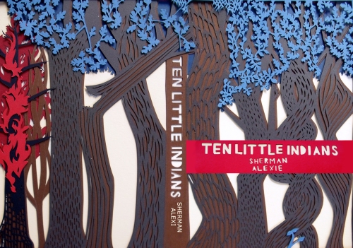
I work in hand-cut, multiple-layered silhouettes. Using paper as my primary medium came about as chance, but has its roots in my past. Even as a kid I was interested in working in paper, starting with making increasingly complicated paper snowflakes. And when I took an Introductory Chinese class, we used X-actos to cut out patterns out of construction paper and I chose the most intricate one (and used the a really terrible blue and yellow color combo, ugh).

But it wasn’t until I was taking a class that worked with the New York Observer and doing an editorial assignment every week that I finally got to paper. The entire class got the same assignment that was then submitted to the Observer, that would choose one person’s piece and publish it. Every week I tried a different style – watercolor, ink, cardboard and paint, ink resists, etc. After all but the last week had gone by, my professor (Rudy Gutierrez) gave us a final, optional assignment. Around the exact same time that I decided I probably wouldn’t do it, I stumbled on Elsa Mora’s work – a Cuban artist who creates gorgeous folksy silhouettes – and I was determined to try it myself. The end result was being published for the first time and deciding that paper would be a really interesting medium for illustration!

Where do you get your inspiration? Are there any other artists doing similar work that you look up to?

Inspiration for me comes from a lot of places. My work often depicts natural themes and I can safely say that I am greatly inspired by Nature. And even though my work is typically made in flat colors and out of paper, I seek inspiration in all forms of the creative process. I love Walton Ford’s work for his gorgeous, gigantic Audubon-style paintings, Sam Weber, The Museum of Natural History, Salish tribal art, Van Gogh, Magritte, Klimt, Lizbeth Zwerger, and a pinch of Mucha. Fashion always inspires me, when it manages to be both ambitious and beautiful (I’m talking about you, McQueen, and your protegé Sarah Burton). Graphic Designers and Typographers always have the power to blow me away with the right project (currently crushin’ on Jessica Hische’s type work). Ancient Mythology, Witchcraft, and Nintendo too. I’m truly an obsessive researcher and love to find a thousand pictures of things that are so different from my own, and so powerful.

I am definitely inspired by other paper artists, but I don’t find myself looking at them very often or specifically for inspiration. Elsa Mora, of course, my alma mater of cut-paper. Kako Ueda does gorgeous, big pieces that combine flat paper with oil (or maybe gouache). Her work really fascinates me in its complexity and its darkness. Rob Ryan does a lot of really effortless-looking pieces that are sweet in their kitsch. And Bovey Lee’s use of perspective is always of great interest to me (find her piece that has a dress hanging on a chainlink fence and you’ll know what I mean).

The thing that I think sets me apart a bit is that cut-paper is by and large a fine arts world, with Rob Ryan being an exception there, and maybe Elsa Mora a bit. I had to think hard about applying paper as an Illustration form, because it can be pretty unforgiving, but definitely rewarding.

What is the process of completing one of your pieces?

The process differs a bit depending on whether or not I’m working in multiple layers, or if there are interwoven pieces, etc. But I always start with thumbnails that become bigger sketches, mainly for perspective and composition. Colors come later, and I go to my collection of paper that is simultaneously way too big and not nearly enough to pick out the appropriate palette. Then I start with the topmost layer, draw it out, cut it out, trace it on to the next layer, and keep working like that until it’s finished.

What are some of your favorite go-to materials, papers, etc.? Do you enjoy using any other mediums?

Hm… there’s a brand of handmade papers at New York Central that I love, especially this one orange that I’ve used too much lately. And I bought this textured, dull silver that I can’t wait to find the right project to let it loose. Indigo and Ivory are my black and white respectively, although I do use a bright white to contrast the Ivory sometimes. Canford cardstock is a great paper for its weight and the colors are really good. And always, always, always, a Number 11 X-acto blade.

And yes, I love working in watercolor. It’s funny to me because watercolor is so layered and diaphanous, with beautiful stains, and it’s very much the opposite of my paper work in a lot of ways. But I do love it, and am actually working on a Children’s Book that is going to be done in watercolor and ink.
Where do you see your work going in the future? What venues do you see your illustrations working best?

Lately I’ve been playing around with taking a complicated pattern and placing it on a piece of paper that is the same color, achieving a more subtle effect of shadows. It’s a lot of work for some shadows, but I’m a big fan. And I’m getting into a lot of typography too. New colors on the way!

I have to laugh a bit at the last question because I’ve spent a lot of time since graduating exploring a lot of venues. I’d really like to get editorial work, and a lot of people in that area have expressed interest. Being asked to do a few giant one-layer silhouettes for window displays is a fantasy of mine. Without a doubt, I want to publish an illustrated book done completely in paper. Album art would be incredible, especially if it were incorporated into the entire design. And I think that my dream job is doing book covers. I know that Penguin occasionally hires an illustrator to design a line of books and that would absolutely extraordinary. In the end, I’m open to everything. I always want to tackle new challenges.

New Artist Showcase: Danny Quirk

This is a post in a series of interviews featuring up-and-coming illustrators, in a celebration of the first annual Illustration Week.  Enjoy!

Danny Quirk

Website: http://www.behance.net/dannyquirk

Blog: http://danquirk.blogspot.com

Your work is incredibly realistic. What is your process of completing a painting?
Everything is a staged photograph, collaged/comped in Photoshop, and that finished ‘comp’ is my sketch. From there, if I have time I’ll draw it out, or else graphite transfer the image onto paper. From there, just start painting away. ha. For the Marines series, bought uniforms/guns/props (all current to date/location) and used that as reference. If there’s one thing I can’t stress more ESP for realistic artists, it’s DO YOUR RESEARCH/ HAVE SOLID REFERENCE.

It just makes a world of difference in the final.

The anatomical ones are actually lots of fun to do. Generally speaking will ‘dissect’ a region of the body and photograph it. How I go about this is I’ll draw the anatomy ON the body, exactly where it would fall under the skin in permanent marker. From there, paint flesh tone latex over the anatomy, and have the subject cut it/peel it open, so when photographed, there will be the exposed anatomy in slight perspective as it would move with the body.

What gallery shows has your work been in lately? How did you pursue those opportunities?
They started off a lot with restaurant gallery places, and kind of worked their way up from  there, a really awesome place everyone should check out is G2 Ave A, it’s  free to show in, and the artist keeps 100% of the sales (shown there 3 times so far). From there showed in the 320 studios, and then did a showing of the military pieces in the 69th Fighting Regiment’s Armory. There were others in-between, but I won’t bore y’all with that. haha. But one MAJOR thing learned from these is network your asses off. Go to shows, be proud of your work, and talk to people, form alliances with those who are similarly different to you. It’s easy for galleries to turn down 1 artist at a time, but the more you have coming in, with strong work of similar themes/different styles (or vice versa) they’re less apt to turn you down, giving yourself another opportunity to be seen, and fact of the matter is, you just never know who could come through and see it.

How did you get into drawing Celtic knotwork?
Haha, it’s kind of embarrassing, but I was always fascinated by it, but never knew how to do it… My freshman year at Pratt, there was this girl I was totally head over heels for, and decided I’d break the news with an elaborate Celtic love letter. haha. Needless to say the feelings weren’t reciprocated, but it got me hooked on learning more about knotwork/means of construction, and to this day, it’s probably my favorite genre of work to do.
What excites you about Medical Illustration? Do you have any advice for other illustrators looking to get into the same field?
What I love about medical illustration is it is probably the ONLY field in illustration (or art for that matter) where work outweighs the worker. Plus, hyper technicality/realism is the only acceptable way to produce it.  Sadly, it requires a lot if extensive schooling (which is generally the main deterrent) but as soon as you’re out, almost guaranteed a JOB, not freelancing, but a real job. ha. Starting pay is roughly $60,00 a year, but if you’re talented/knowledgeable, not uncommon to exceed $250,000 a year off the work. Generally these top dogs work with law firms/pharmaceuticals, but that’s actually where most the ‘work’ comes from. Law firms need artists to illustrate/educate the jury in medical malpractice cases, and pharmaceuticals need artists to show how their products work. ha. One thing I’d offer to those interested (I totally regret not doing) is DON’T major in art, major in science/minor in art. There’s much more of an emphasis on science aspects and such that you’ll be at a massive disadvantage upon being accepted. First year is basically graduate level med school, which is why I’m taking a bunch of science courses as we speak. ha.

If you could meet any artist, dead or alive, who would it be?
Hmmm, being a massive Tool fan/appreciator of his work, I’d say Alex Grey. But that’s a borderline cliche answer coming from me. ha. Dead though, it would definitely have to be Jean Baptiste Boughry… He was an anatomist/surgeon/artist, and spent 25 yrs making his book “Atlas of Human Anatomy and Surgery”. It’s  pretty much my Holy Grail. Work is amazing, deliciously detailed, and totally worth every penny. It sucks as an anatomy book though for anyone not familiar with the body because nothing is labeled, but absolutely gorgeous work. If only I could have been one of the hundreds of flies on his wall and seen his process.