Category Archives: illustration sensations

… sweeping the nation! All things illustrated go here.

Re-Seussify Seuss Challenge

Image

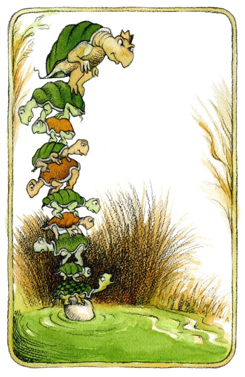
In case you missed it, this week’s results for School Library Journal’s Fuse #8 Re-Seussify Seuss challenge were in, and they were pretty spectacular! The mission, as set forth by children’s lit guru Betsy Bird, was to draw a spread from a Dr. Seuss book, but in the style of ANOTHER famous picture book artist. I was inspired by the fun mash-up idea, and pulled off the image of Yertle The Turtle in the style of Arnold Lobel, above.

The idea for the image itself came to me pretty easily. It’s no surprise that I love drawing turtles, and Yertle The Turtle is a family favorite. The reptile vs. amphibian factor – Yertle crossed with Frog and Toad – was amusing to me as well. In particular, I wanted to try my hand at Arnold Lobel’s style. I thought the limited palette with textured graphite would be fun, and his characters and watercolors lend themselves easily to my own style. Plus, he’s a fellow Pratt alum!

I learned a lot about Arnold Lobel’s creative process from this video with his daughter, Adrianne Lobel.  She sought to replicate her father’s paintings when she colored Arnold Lobel’s unfinished The Frogs and Toads All Sang:

I am very interested in Lobel’s use of color separations to make the Frog and Toad illustrations, and I wish I could find more on the subject. While Adrianne went with full-color in her recent interpretation, I wanted to imitate the 2-color (and black) separations by sticking to a green layer, a brown layer, and dark graphite.  I’m pleased with the result and think it was rather successful, if I do say so myself.

Now go check out Betsy’s post for the other mind-blowing creative Re-Seussification mash-ups!

From The Slush Pile: Summer Finds

You know I’m busy at work when instead of going through art samples with my morning coffee, they pile up on my desk.  Today, I finally took lunch to sort through a few.  Check out some exciting new finds that came in lately!

Casey Uhelski / For pet lovers (like me!), this SCAD grad has mastered the expressions of adorable dogs, cats and bunnies.

Victoria Jamieson / Victoria’s anthropomorphic characters have landed her a two-book gig with Dial (part of the Penguin family) in 2012/2013.  In the meantime, I think her revisiting of Ramona Quimby is spot-on.

David C. Gardiner / This image might suggest that David and I are cut from the same cloth, stylistically, but his Flying Dog Studio also produces everything from fairly realistic older characters to animations.

Caitlin B. Alexander / This Austin-based illustrator’s folksy-yet-modern style looks mostly editorial, for now… but wouldn’t it make a charming children’s book?

Veronica Chen / I was intrigued by her intricate black-and-white patternwork, but her color piece Chameleon City just begs for a story to be told.

Jillian Nickell / This quirky, vintage-inspired vignette was fascinating enough to lead me to her website, where there’s a great series of pieces based on The Borrowers, and more. I can picture her style being perfect in the right book for older readers!

Best of Student Work 2011 – Part 2: The Pratt Show

Mozart at the Beach from Christee Curran on Vimeo.

Oh, the Pratt Show . . . it’s hard to believe that it’s been a full year since all the momentous graduation-related events were happening to me!  It was great to be on the other side of things last week… browsing new artists, sipping champagne and catching up with old classmates, without the stress of having my own work in the show.

This year’s class certainly didn’t disappoint in talent!  I was so proud to see many familiar faces represented at the show, from Sarah Mimo‘s swoonworthy clocks, to new textile prints from Alexa MacFarlane and new comics from our former Putnam intern, Kris Mukai.  I’m also jumping for joy to showcase Christee Curran‘s video storyboard project (above). How adorable is that kid at the beach?!

In addition to old friends, there were also a few new faces at the show.  Here were my favorite kids’/book related discoveries:

1. Alexandria Marie Compo / I loved her quirky animal characters, and combination of digital and hand-crafted work. In fact, we were all so taken with her 3-D figures that they almost “walked” away with us!  Very well suited for the pages of a trade hardcover picture book.

2. Michelle Lynch / Michelle’s range of work is crazy – I’ve honestly never seen a graduating student grasp the concept of licensing so well!  Her style may be “simple”, but she captures a bright, cute and fun spirit with ease, and then translates it to a wide variety of products, books and character designs.

3. Erin Maala / Erin’s intricate paper-cutting skills had all of us Penguin employees drooling over her book jackets like Wuthering Heights and The Bell Jar. Another classic book series in the making, perhaps?

4. Zoe Norvell / With smart, sophisticated humor, Zoe designs books that are seriously attention-grabbing.  I especially appreciated the wit and depth of information in her collections The Future Of The Book and OKCupid.  Oh, and – how could I forget? – she redesigned Harry Potter, and we liked it. A lot.


lil zines and silkscreens from jane mai on Vimeo.

5. Jane Mai / Her work might look like it could be for kids, but trust me . . . it’s grown-ups only.  But her irreverent, freaking-hilarious style translates perfectly to comics, zines and more – so make sure to head on over to her site for the full experience!

Best Of Student Work 2011 – Part 1: SVA MFA Thesis Show

May means graduation time, and New York City is filled with student exhibitions and senior work on display for the world to hire.  So for the next few weeks, I’ll be snooping several art schools’ openings for new and inspiring illustrators, and bringing the best of the best right here to the blog.

I started with the School of Visual Arts’ MFA Thesis exhibition last night!  I’d highly recommend trekking to Chelsea for both design and illustration. Details below:

Visual Arts Gallery / 601 W 26th Street, 15th floor

April 29-May 14, 2011 / Mon-Sat, 10 am – 6 pm

All the student work was of exceptional quality (they ARE MFAs, after all), but here were my Top 5:

1. Hye Su / Looking at Hye Su’s body of work is like stepping into a completely different universe.  Her mastery of a range of mediums (from embroidery, to zines/books, to 3-dimensional objects) remain entirely consistent – everything is shown through her very unique lens.  I couldn’t get enough of her wild and wonderful characters!

2.  Lisa Anchin / Of anyone else at the show, it was Lisa who was made for children’s books.  I was impressed how prolific and professional her work was – at least 4 or 5 book dummies ready to go, and full of adorable characters and dynamic compositions to boot.  Lucky for me, guess which Penguin imprint she’ll be interning at this summer?  That’s right… we’re very excited to have her!

3.  Philip Cheaney / How excited was I to see someone who created a fully-formed eBook app?!  I was really impressed with (read: jealous of) its smooth, polished look on the iPad.  His bold, graphic lines and color sensibility are perfect for medieval subjects like Tristan & Iseult.  Check out his animations here.

4.  Pimlada Phyapradit / Pimlada’s another artist with a very different way of approaching characters.  Her broken-down toys are sweet and childlike, but with a touch of melancholy.  I’m most impressed, though, with the muted pastel tones throughout her book – it really adds to the wood textures and her drawing style overall.

5.  Jungyeon Roh / Jungyeon’s silkscreen prints are seriously, seriously stunning.  The illustrations for her book, Hot (featured in the show), somehow strike a balance between whimsical color and powerful content, with a bonus of beautiful hand-drawn type.  I wouldn’t be surprised if she continues to garner major awards and editorial publications in the future!

From The Slush Pile: Great Animal Illustrators

Today was a more wackadoo day in illustrator submissions than usual, so I thought I’d give myself a pick-me-up by highlighting three great illustrators who draw some super-cute animals.  Enjoy!

1. CharrowMy first favorite recent find is Charrow, whose quirky illustrations exude a playful spirit and sense of humor.  Her light watercolor and drawing technique feels breezy, like she just jotted down some animals, and they happen to be hilariously adorable. She’s also a frequent contributor to They Draw and Cook. Her Etsy shop is down at the moment, but when I checked it out a few weeks ago, it was easily my favorite part of her portfolio… be sure to check back for it soon!

2. Stephanie GraeginProbably my all-time favorite illustrator submission ever is a little “mini portfolio” booklet from Stephanie Graegin.  Her Renata Liwska-style woodland creatures, accented by limited color and unlimited sweetness, had both design and editorial drooling. Crossing my fingers that I see a book with her name on it soon!

3. Lizzy HallmanIf illustrator David Catrow’s art proves anything, it’s that there’s a place in this business for a little ugly-cute.  And if my love of french bulldogs proves anything, it’s that I will always get behind ugly-cute!  Hallman’s characters may have wonky eyeballs, but they make their expressions unique and humorous. And her color treatment? 100% sweet!

Updated Links and New Artist Alert!

Time for a little spring cleaning, aka. link updating. If you haven’t noticed, down the column on the right are a bunch of fantastic blogs that I read regularly, and I try to occasionally go through and add/delete links so the list stays fresh with active bloggers. It’s a great place to turn to when I’m lazy busy here at Walking In Public!

I’m sure I’m missing blogs, though, so if you’re reading this and want me to add yours or a friend’s, add a comment below (note: I try to keep it to blogs only, not static websites).

Speaking of friends, can we discuss how amazing are Pratt student Sarah Mimo‘s hand-crafted clocks (above)?  I’m astounded at her innovation and stunning detail . . . wow.  Talk about a senior project that deserves buzz. Her new artist blog is full of more clocks, as well as some lovely textural illustrations, so make sure to head over there, pronto!

SCBWI 2011: Stand-Out Illustrators!

This past weekend was the annual SCBWI Winter Conference, a 3-day event, packed with speakers, panels and workshops, that brings authors and illustrators to Midtown from across the country.  I’ve always wanted to go, and finally had the chance to attend the Illustrators’ Intensive by begging offering to help out a bit.

Friday was all about children’s books and new media (more on that later), but one of the most fun perks was getting to see the showcase of illustrators that was set up for judging and industry viewing.  As I tried to have fun and not to get overwhelmed by the VIP cocktails and networking, I managed to grab a few cards of my favorites.

I was pleased, but not surprised, that Leeza Hernandez (above) won the Grand Prize at the showcase. She’s super talented, and has a friendly, approachable personality to boot. But I’ve been following her work for some time, so while she deserves much congratulations, she doesn’t count on my list of “new discoveries” . . .

1. Andrea Offermann /  It was so lovely to meet German illustrator Andrea Offermann, whose rich, detailed porfolio is breathtaking.  Her work is perfect for older, middle-grade readers – book covers, black and white interiors, graphic novels.  I won’t be surprised to see her art all over the shelves!

2. You Byun / Aww, how sweet are those characters’ faces?  And look at the lush range of texture!  And warmth of light!  When it comes to creating worlds, You Byun has it down.  And I’m seriously gushing over every single one.

3. Greg Pizzoli / Okay, this guy’s silkscreen prints are just too freaking cool. I’ve got major jealousy looking at his 32-page promotional zine, C’mon, Go!, and the hand-bound editions of his books are fine art, but could so easily be commercially reproduced.  His website is most effective too, with a fun, in-depth look at his process.

4. R.S. Posnak / We designers made a beeline for R.S.’s Oliver Jeffers-esque line work and letterpress business cards (we’re too predictable).  Turns out, she’s also a designer, and has an online portfolio with a healthy mix of sleek commerical projects (for adults) and vintage curios.  Hello, animal dioramas!

5. Brian Gerrity / On the other end of the spectrum, Brian Gerrity’s work is made for kids.  Fun, bubbly characters, with a smooth digital look, are perfect for little ones.  And what a whimsical sense of pattern… you can look back at the picture again and again, and still find something new.

From The Slush Pile: Hand-Lettered Type

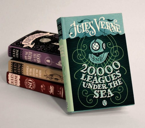
While going through the slush mail today, I came across a pair of standout illustrators in a pile of recent UArts grads. Jim Tierney and Sara Wood, a young Brooklyn couple, have a fantastic approach to book cover design.  Their masterful combination of type, hand-lettering and drawing makes both of their portfolios equally impressive.

Check out Sara’s D. H. Lawrence book cover series, and Jim’s interactive Jules Verne thesis (there’s a video too!).  I put the cards up on the “Wall Of Stuff I Like” in my cube, right next to our other favorite hand-drawn type designer, Kristine Lombardi.  Lombardi’s cards have been up on our wall for ages.  While her cards have more of a feminine, fashion style (although I do like her Kids page!), they are the first thing that designers walking by are ALWAYS drawn to.  Check out a great interview (including the below image of her promo card) here.These designers got me to thinking: where’s the place for hand-lettered type in children’s books?  Before the age of thousands of freebie fonts on the internet (hey, it wasn’t that long ago!), hand-lettered display type was commissioned for book covers all the time. I recently worked on the anniversary edition for Jacqueline Woodson’s The Other Side, and I was so impressed to discover that the handsome title was calligraphed by the original in-house designer.And while I’m sure it took a lot more effort than downloading a font, there’s something careful, purposeful and yet whimsical to hand-drawn type.  So it’s no surprise that it is experiencing a rebirth of magnificently hip proportions. Now, type everywhere looks like this:Want 5,000,000 examples?  Just head to Flickr.  The New York Times.  Or anywhere.  I used to make fun of the fact that you could tell all the films addressing the teen “Napoleon Dynamite” audience (or that have Michael Cera in them) by their hand-drawn titles.In art school, we used to hear constantly, “if you want it to look hand-drawn, do it yourself.”  Designers, as a whole, have embraced this ideal. Children’s books, on the other hand, don’t have the same prejudice when it comes to handwriting typefaces.  Hand-lettering might work for display type, or a few very special people (ahem, Maira Kalman and Oliver Jeffers). But on the whole, handwriting fonts keep kids’ books looking consistent, read-able and changeable over 32 pages. 9 times out of 10, a handwriting font will actually look better than what you could do yourself. That being said, when it comes to display type and interesting details, I’m all for hand-drawn type in children’s books.  It’s fresh, playful and unique.  And with the rapid changes in technology, we may not need to draw type anymore, but I have a feeling that more lettering opportunities will open up for type designers anyway – just because we’re craving that physical, hand-created feel!

The Original Art Show Opening Reception Recap

Last Thursday, I had the pleasure of attending the 30th Annual Society of Illustrators’ Original Art Show opening reception!  It was a crowded, swinging party full of the best children’s book illustrators of the year, plus the editors, art directors/designers, friends and family who support them.

I’m not gonna lie – I was a little nervous about being there with so many people I admire, but don’t actually know.  But I wasn’t nervous enough NOT to go, and I’m so glad I did!  There were quite a few Penguin people there, so I wasn’t without my fellow assistant-types.  But the cool part was getting to briefly meet some awesome Putnam illustrators, and put faces to names for industry folks who were wandering around the event.  From the moment I ran into Eric Carle on the stairs (within 2 minutes of being there), my mantra of the evening was turning around, only to look at someone’s name-tag and go, “Whoa, I’m two feet away from ___________!”

The awards ceremony filled me with pride for being in the children’s book community. All of the winners were excited to be recognized by their peers, and there wasn’t one speaker who didn’t seem like a lovely, humble person.  Silver medalist Dan Santat, especially, seemed touched by the award and reminded us that this is one of the few occasions where illustrators, usually holed up alone in their studios, get the chance to be validated for the great work that they do. Aw.

The Gold medalist, Renata Liwska, is a huge illustrator-crush of mine, and I’m so glad that she won the top award of the year for The Quiet Book!  Her adorable animals are just up my alley, and I can’t wait until her book with Philomel, Red Wagon, comes out this winter.  The cutest!  Check out some of her sketches (believe it or not, her finishes are digital) on Amazon as well.

The highlight of the evening, hands down, was getting to hear Eric Carle accept his Lifetime Achievement Award. At 81, Carle is a champ for coming all the way down to NYC. Though his “senior moments” came out just a bit when he mixed up a few of his own life details (he has had quite a lot of experience!), his wisdom was more than clear. The laughs came when he mentioned that he “never really thought of himself as an illustrator” – says the creator of the most famous picture book ever. But I thought it was so interesting how he described the relationship between his graphic design/advertising background and the way that he composes his illustrations.  Carle said that every picture book spread he makes, he designs as a poster. Bold color, clear compositions, graphic shapes. Isn’t that incredible?

The award that hits closest to home is the Founder’s Award, which is given to an up-and-coming talent in the field (this year, it was Hyewon Yum).  Now, here’s how I feel about awards: they’re nice to get, but they don’t really matter. With so many equally talented people out there, awards like these are full of out-of-your-control factors like the tastes and predisposition of the judges. So don’t bother thinking about it, because there’s really not a lot you can, or should, do to “try to win” an award.

That being said. I WANTSSS IT. The Founder’s Award, I mean. I have too much competitiveness in my bones not to want that award someday (at least a little). And with the board books already published, that means I have one chance to win it.  In short, my picture book debut better be smashing.

But enough about awards.

It was way too crowded to check out all of the books and art displayed at the Original Art Show, so I’m going again with the rest of the Putnam crew in a couple weeks.  I’ll report back on my findings later!

Happy Birthday, Ed!

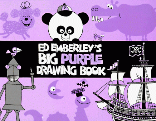
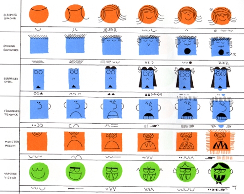
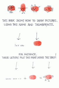
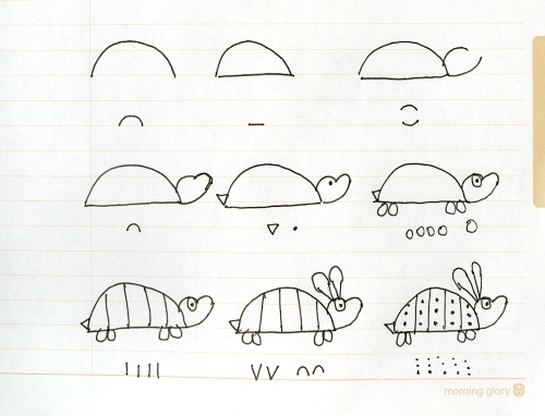
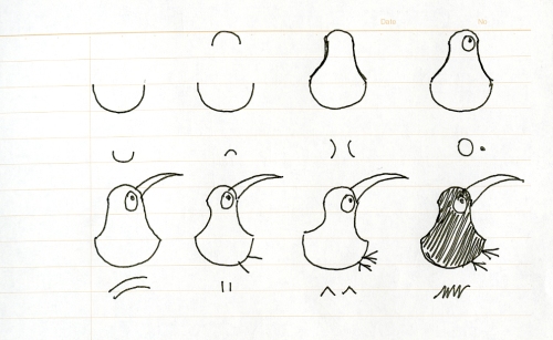
It was Ed Emberley‘s birthday yesterday, so I think it’s time for a little celebration of my favorite step-by-step drawing master!  Emberley is famous for his simple shape-drawing method, and I myself used to spend hours and hours copying every bit of his video, Squiggles Dots and Lines. His techniques are elementary, but now I have a whole new appreciation for his fascinatingly clear design sense.  Plus, how much fun is it to make those little thumb-print people?

Thinking about ol’ Ed made me doodle some of my own characters in “Emberley” form:

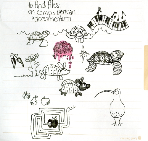
And then doodle some more… (that’s my brain melting from the training session I was in, by the way. Oops!)

Happy Birthday, Ed Emberley!  You’re my hero.