Category Archives: happenings

Events in the city, and other high-profile . . . children’s book . . . gatherings.

Park Slope Methodist Book Sale Finds

This weekend was one of my favorite annual Park Slope traditions: the Park Slope Methodist book sale!  Every year, this neighborhood church collects thousands of book donations (and CDs, and records) of every kind, and the BK literati flock to pick up hardcovers and paperbacks for just a dollar or two.

This year, I tried to exercise some restraint – after all, I’ve got books spilling out of the shelves in my room as it is!  But I did manage to pick up a few art and home-related titles (I was in a non-fiction mood), that are really fun!

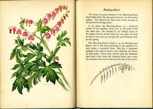
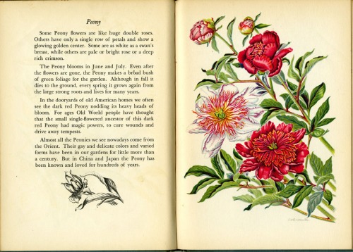
My favorite book of the day is A Book Of Garden Flowers by Margaret McKenny and Edith F. Johnston (Macmillan, 1940). Margaret McKenny turns out to be a renowned Washington State naturalist, and I later found some of her enthusiastic letters about mushroom hunting. But the piece de resistance is Edith Johnston’s GORGEOUS lithographs of flowers! Each one is more beautiful than the next (so much so that I almost scanned the whole book!). Take a look . . .

Truly lovely, no?

I also picked up a couple of cookbooks that I’m really digging:

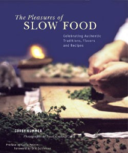
The Pleasures of Slow Food by Corby Kummer (Chronicle Books, 2002). – This glamorous coffee-table volume takes a warm glimpse into the “slow food” movement – where hand-crafted cooking methods enjoyed among company take the place of modern American fast-food culture. I can only hope that I’ll get around to cooking soft-shell crab bisque or pickled herring with apples and creme freche, because the photos are absolutely drool-worthy!

Speaking of photos, I’d never normally buy a cookbook without them, but this little gem caught my eye and I think it’ll be most useful! Edible Pockets For Every Meal by Donna Rathmell German (Nitty Gritty Cookbooks, 1997) is a super-simple guide to all kinds of dumplings, turnovers and “pasties” ( . . . whatever those are!). You can mix-and-match various dough/roll recipes with endless combinations of fillings from different cultures.  Check out how friendly the design is:

Want some of these delightful titles for yourself? Make sure to be on the lookout for the Slope’s book sale next February!

ECC Event Invite: Hunger Pub Games!

Calling all young publishing professionals (sorry, Early Career Committee events are for employees of CBC member houses only) –

Join us for the 1st Annual Hunger Pub Games!  See below for the event invite I created… and RSVP to see in person all the challenges that await. It’s going to be a ton of fighting- I mean, fun!

Bemidji Book Festival 2011

You’d think that being in rural Minnesota wouldn’t bring much in the way of industry happenings, but that couldn’t be farther from the truth.  My Midwest visit just so happened to coincide with the Bemidji Book Festival, a 6-day marathon of events with local authors, poets and illustrators.  Kudos to the Bemidji Library and the MN Legacy Fund for making this all happen!

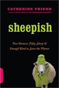
I stepped off the plane and immediately headed to a presentation by Catherine Friend, author of both children’s stories and the adult books, Hit By A Farm, Sheepish, and The Compassionate Carnivore.  With a humble, witty voice on her 1 1/2 memoirs and a great perspective on local farming (and sheep), she’s like a lady Michael Pollan with a personal touch.  I’m thinking it’s time to take a closer look her kids’ books, and also take up knitting!

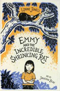
The next morning, I accessed my inner child by attending Thursday morning’s library event with author/illustrator Lynne Jonell.  While Jonell got her start in picture books, she’s now known for her middle-grade novels, like Emmy And The Incredible Shrinking Rat.  I think the design (by Amelia May Anderson) and art (by Jonathan Bean) for Emmy is impeccable – the hand-drawn type is seamlessly integrated to the limited-color line drawings, which carry over into a flip-book style interior. Plus, it was a pleasure to listen to Lynne’s story and watch her graciously field questions from aspiring picture book authors with just the right answers (five letters: SCBWI) and some kind inspiration.

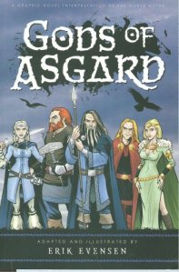
On Friday night, we headed to the high school for an author’s fair.  While most of the authors were of the niche, poetry or self-published variety, I did discover Erik Evenson, a graphic novelist/illustrator who is – get this – originally from New Hampshire!  His Gods of Asgard and autobiographical web comic, Erik’s Sketchbook Diary, were easily the best-designed finds at the fair.  Definitely check out his work if you’re interested in comics.

But nothing at the festival could top Friday’s keynote speaker, Roxana Saberi.  Saberi, an Iranian-American journalist who was imprisoned in Iran and falsely charged of spying in 2009, now speaks about her life, Iran, and the book she wrote about her experiences (Between Two Worlds: My Life and Captivity In Iran).  She talked eloquently and powerfully about the human rights movements in Iran and the Middle East, and it certainly encouraged me to get more involved.  Can’t wait to finish reading her book!

It’s been an action-packed visit here in Bemidji, and while I’m always happy to return to Brooklyn, I could still use another week or two relaxing in the country and soaking up all that Minnesota has to offer.

Belated BEA Busyness

Well, it’s been another one of those times where my blog has hit a bit of a lag!  My life these days is crazy busy, personally and professionally, so I really can’t complain.  Unfortunately, it doesn’t leave a lot of room for writing about my experiences or keeping up with my social media presence.  So now that I’m comfy on the recliner on vacation in Bemidji, it’s time to play a little Walking In Public catch-up…

First off, if you haven’t headed over to my new gig as a columnist on the blog, Publishing Trendsetter, you want to go to there!  The site is full of great advice and insight from young professionals on those either in their first few years, or looking to get into the industry.  As for me, I’ll be bringing the visual inspiration with the column, Design Candy.

A few weeks ago, I kicked it off on Trendsetter with my favorite design finds, head-to-head, from the publishing extravaganza of the year, BEA.  But I had a lot of favorite moments that didn’t make it onto that post.  For some reason, most of the Big 6 publishers disappoint – their large space isn’t utilized with books, but posters/video screens that don’t make an impact.  It’s the indie publishers (plus the usual suspects in Chronicle, Candlewick and Abrams) that make up the best exhibits.

Missed BEA the first time around?  Check out my highlights now:

Chronicle Books: Is designer heaven – no one even comes close to these guys in my book.

Abrams: They always pull out all the stops, this time with a giant snowglobe.

International: Saudi Arabia is by far the friendliest, but I love looking through all the foreign-language books.

Candlewick Press: No pics of the display, but note the presence of actual kids’ books.

Workman: Fun exhibit full of books, and I got a Sophie Blackall Missed Connections poster – my favorite swag of the day!

Enchanted Lion Books: Nice use of the full jacket proofs on the background.

Mo’s Nose: These self-publishers pulled out all the stops with cool display and marketing.  Plus, I think the idea of an app based on a scratch-and-sniff book is hilarious.

Hyperion: Okay, I have to be honest, this is not on my favorite list.  I just have to ask… what is with the harvest cornucopia?!  I can’t help but laugh at this one.

And, of course… here’s Penguin:

Best of Student Work 2011 – Part 2: The Pratt Show

Mozart at the Beach from Christee Curran on Vimeo.

Oh, the Pratt Show . . . it’s hard to believe that it’s been a full year since all the momentous graduation-related events were happening to me!  It was great to be on the other side of things last week… browsing new artists, sipping champagne and catching up with old classmates, without the stress of having my own work in the show.

This year’s class certainly didn’t disappoint in talent!  I was so proud to see many familiar faces represented at the show, from Sarah Mimo‘s swoonworthy clocks, to new textile prints from Alexa MacFarlane and new comics from our former Putnam intern, Kris Mukai.  I’m also jumping for joy to showcase Christee Curran‘s video storyboard project (above). How adorable is that kid at the beach?!

In addition to old friends, there were also a few new faces at the show.  Here were my favorite kids’/book related discoveries:

1. Alexandria Marie Compo / I loved her quirky animal characters, and combination of digital and hand-crafted work. In fact, we were all so taken with her 3-D figures that they almost “walked” away with us!  Very well suited for the pages of a trade hardcover picture book.

2. Michelle Lynch / Michelle’s range of work is crazy – I’ve honestly never seen a graduating student grasp the concept of licensing so well!  Her style may be “simple”, but she captures a bright, cute and fun spirit with ease, and then translates it to a wide variety of products, books and character designs.

3. Erin Maala / Erin’s intricate paper-cutting skills had all of us Penguin employees drooling over her book jackets like Wuthering Heights and The Bell Jar. Another classic book series in the making, perhaps?

4. Zoe Norvell / With smart, sophisticated humor, Zoe designs books that are seriously attention-grabbing.  I especially appreciated the wit and depth of information in her collections The Future Of The Book and OKCupid.  Oh, and – how could I forget? – she redesigned Harry Potter, and we liked it. A lot.


lil zines and silkscreens from jane mai on Vimeo.

5. Jane Mai / Her work might look like it could be for kids, but trust me . . . it’s grown-ups only.  But her irreverent, freaking-hilarious style translates perfectly to comics, zines and more – so make sure to head on over to her site for the full experience!

Best Of Student Work 2011 – Part 1: SVA MFA Thesis Show

May means graduation time, and New York City is filled with student exhibitions and senior work on display for the world to hire.  So for the next few weeks, I’ll be snooping several art schools’ openings for new and inspiring illustrators, and bringing the best of the best right here to the blog.

I started with the School of Visual Arts’ MFA Thesis exhibition last night!  I’d highly recommend trekking to Chelsea for both design and illustration. Details below:

Visual Arts Gallery / 601 W 26th Street, 15th floor

April 29-May 14, 2011 / Mon-Sat, 10 am – 6 pm

All the student work was of exceptional quality (they ARE MFAs, after all), but here were my Top 5:

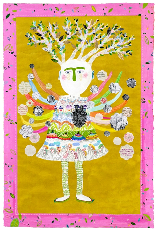
1. Hye Su / Looking at Hye Su’s body of work is like stepping into a completely different universe.  Her mastery of a range of mediums (from embroidery, to zines/books, to 3-dimensional objects) remain entirely consistent – everything is shown through her very unique lens.  I couldn’t get enough of her wild and wonderful characters!

2.  Lisa Anchin / Of anyone else at the show, it was Lisa who was made for children’s books.  I was impressed how prolific and professional her work was – at least 4 or 5 book dummies ready to go, and full of adorable characters and dynamic compositions to boot.  Lucky for me, guess which Penguin imprint she’ll be interning at this summer?  That’s right… we’re very excited to have her!

3.  Philip Cheaney / How excited was I to see someone who created a fully-formed eBook app?!  I was really impressed with (read: jealous of) its smooth, polished look on the iPad.  His bold, graphic lines and color sensibility are perfect for medieval subjects like Tristan & Iseult.  Check out his animations here.

4.  Pimlada Phyapradit / Pimlada’s another artist with a very different way of approaching characters.  Her broken-down toys are sweet and childlike, but with a touch of melancholy.  I’m most impressed, though, with the muted pastel tones throughout her book – it really adds to the wood textures and her drawing style overall.

5.  Jungyeon Roh / Jungyeon’s silkscreen prints are seriously, seriously stunning.  The illustrations for her book, Hot (featured in the show), somehow strike a balance between whimsical color and powerful content, with a bonus of beautiful hand-drawn type.  I wouldn’t be surprised if she continues to garner major awards and editorial publications in the future!

AIGA’s 50 Books/50 Covers Exhibit

On Monday, the Art Department took a field trip to see the AIGA’s 50 Books/50 Covers of 2009 exhibit.  It was a worthwhile show to attend, but I had mixed feelings about it.  For one, the non-traditional gallery presentation (above) brought both advantages and challenges.  I loved the low bleacher set-up for books, because I could sit and relax while browsing heavier volumes.  But the bleachers did the covers a huge disservice; not only did you have to bend down repeatedly to pick up each individual cover, you had to flip the card over to even see the image.

But the main reason that I left ambivalent over the 50/50 exhibit encompassed more of my greater feelings about design in general.  Without a doubt, the books on display were creatively inspiring.  I loved thumbing through the photos and art, the lavish paper stocks, and the 3-dimensionality of a beautifully-presented package.  Books like these make me want to go home, stay up all night and make ART.  It makes me feel a little inferior that I’m not doing that kind of work already.

At the same time, though, many of these books get right to the heart of one of my greatest pet peeves: design for design’s sake. Design should always serve a purpose, complement its material, and make content accessible to its consumer. I love design because it places equal importance on being functional AND visually pleasing.  But many of the 50/50 books suggest the opposite. Type running into more type, or scattered across the page, or written in tiny Helvetica Bold . . . these things appeal to the hipster art-design community, but aren’t the best solution for the general reader.  Go ahead and be as artsy as you want, but please, let it make sense.

That being said, I’ve composed some highlights of the exhibit to present my case.  I’ll showcase my favorites, as well as some titles that really made my blood boil.

A perfect example to explain my point?  Two books, no type on the cover:


Afrodesiac (AdHouse Books) – Perfectly captures the 1970s exploitation and comic book crazes. The interior contains pictures, not words. Generally all-around badass.

vs.

Manuale Zaphicum (Jerry Kelly LLC) – Yes, the letterpressed interior is absolutely gorgeous, but I found a blank cover for a book about a type designer to be annoying-ironic, not funny-ironic.

See what I mean?  Okay, now on to some favorites:

Pictorial Webster’s (Chronicle Books) – Gimme gimme gimme those vintage engravings!

What Is Affordable Housing? (MTWTF) – A clear, accessible and handy guide that speaks to non-designers, but doesn’t sacrifice a bit of design. Bravo!

Silhouette: The Art of Shadow (Gabriele Wilson Design) – My pick of the “elegant art books”.

The Monsterologist (Sterling) – Oh hey, it’s a children’s book!  One of two, the other being Alphabeasties and Other Amazing Types (Werner Design Works, Inc.).

One Million (Think Studio) – Scanning through a million dots is a great way to give abstract numbers some concrete, visual interest.  Image

And now, the best-of the pretty, “touchable” books:

The Original Of Laura (Knopf) – A beautiful way to showcase Nabokov’s last notes with removable versions of his original index cards.

For Jean Grolier And His Friends (Jerry Kelly LLC) – This 500-page doorstopper is an exquisite tribute to fine bookmaking, but I don’t feel worthy to flip through it.

Riley And His Story (Matthew Rezac Graphic Design) – The typographic cover made this one stand out, and I love the layered cut-out trim sizes of the the interior pages.  A moving book of photographs.

Wine Labels (Eduardo del Fraile) – Using cork as the cover and a vertical trim size are perfect examples of out-of-the-box design that actually make contextual sense.

Edward Gordon Craig (Base) – The slice of bright green peeking out from the inside redeems this from the . . .

Helvetica Wall of Shame!!!

50/50 Designers, why do you so often use Helvetica (or something close to Helvetica), when there are an infinite variety of typefaces in this world?!  Is it just so that you can appeal to the hipster, “modern design” consumer with such ease that you don’t have to think about finding something better suited to your project?  For shame!

Note: Some of these books are truly great, but it doesn’t save them from THE WALL.

Everybody Dance Now (Pentagram) – The fun rainbow foil makes this “history of the hipster parties” book… but just barely.

D’Apostrophe (ZAGO) – Love the 3-D cover, but there are plenty of other typefaces that “resonate with the notion of geometry and living forms within positive and negative space.”

MEC (Mevis & van Deursen with Danielle Aubert) – Juror’s comments: “The design and type selection are as cerebral as the work”.  Enough said.

Fabrizio Giannini: Live Without Dead Time (Sidi Vanetti) – Akzidenz-Grotesk = same thing.

SVA Undergraduate Catalog 2010/11 – Also in the “almost-Helvetica” doghouse, but props to them, because I can’t help but look at this book and get jealous.  Why did Pratt give us nothing like SVA’s promotional material?

At this point, you may be asking, do I just have an illogical beef with hipster design and sans-serifs?  Maybe.  Luckily, this is my blog, and I get to rant about it here.
Top 5 Things To See/Know/Do This Week

Since the week has been so crazy for me preparing the Spring 2012 picture books at work, here are a few announcements/discoveries to keep y’all busy:

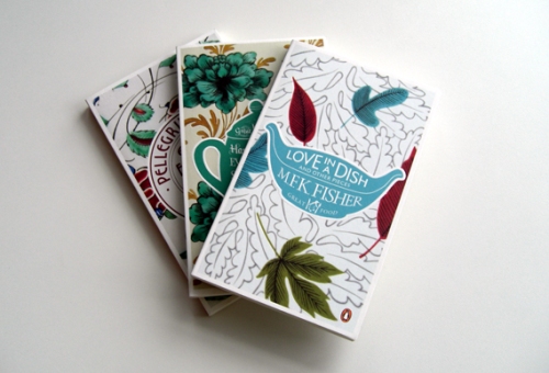
1. Seems that Coralie Bickford-Smith, senior cover designer over at the UK’s Penguin Books, has been on everyone’s brains lately . . . I received two links to her in the past few days!  I have always been a huge fan of her Clothbound Classics series, but I hadn’t seen her full site.

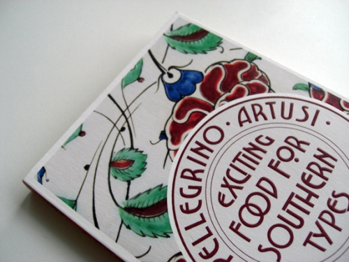
And, my goodness, take a look at her newest work!  I’m getting giddy looking at this Penguin Great Food series (link courtesy of Creative Review, via Ryan, extremely cool fellow designer/cubicle neighbor).  Each plate is based on vintage ceramic patterns, and I seriously can’t get over how gorgeous they are.

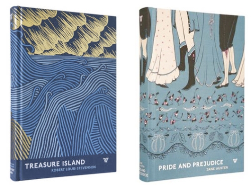
2.  Speaking of how the UK dominates beautiful patterned covers, let’s move along to White’s Books, a small London publisher directed by David Pearson (a former Penguin Books designer himself).  In a different way, these patterns draw the reader into other imagery and bring visually potent symbolism to distinguished classics. Thanks to Kevin Stanton, amazing paper-cut illustrator from the Illustration Week extravaganza, for referring me to Jessica Vendsen’s blog!

3. On a local level, I have to give a shout-out to a new show opening up in town: Maira Kalman: Various Illuminations (of a Crazy World).  I’ve mentioned before my infatuation with Maira’s work, and since she’s a Nancy Paulsen Books author/illustrator, I get to drool over her new children’s books on a regular basis.  Can’t wait to check out this exhibit of many of her best-known works, as I know it’ll be as original and out-of-the-box as ever.

Maira Kalman: Various Illuminations (of a Crazy World) is on display at The Jewish Museum from March 11 to July 31, 2011.  For more info, check out this blog post, with plenty of links to get your Maira fix.

4.  Hey, did I mention I’ve been busy doing some freelance design work for Elizabeth Knight Jewelry?  If you’re in the mood to accessorize, head on over to her website, where you can find collections of nature-inspired, mostly silver work. When we stopped by a group sample sale last week, it was completely mobbed . . . so get this stuff while it’s hot, fashionistas!

As for me, I’m going straight for the Frog Pearl Necklace and Vertebrae Earrings.

5. Times are tough, folks. Amid the economy cutbacks, we gotta defend what’s worth spending money on. Support Planned Parenthood and writing programs like Reading Is Fundamental by clicking on the links, signing your name, and/or writing to your representative.  You’ll be standing up for millions of underprivileged children who gain access to literacy though RIF, and millions of adults who need access to life-saving care (like cancer screenings, HIV testing, and birth control).  Let’s keep our country healthy and wise.  Thanks!

Wake Me Up When It’s Presidents’ Day

Is it the weekend yet? The blog has been feeling a little neglected the past few days, due to the fact  that it has been CRAZY busy around here.  It’s just one of those weeks… something scheduled every day, the “social butterfly” lifestyle that leaves me feeling more exhausted than cool.  I don’t have time to paint or write . . . I barely have time to eat!

Here’s another thing that I missed when I was too busy: The Sketchbook Project 2011I’d sworn I’d fill up the Moleskine (after all, I bought and paid for the chance to be in the exhibit), but after all the holiday rush, the pages were still blank.  I need what my mother calls “brain space” to concentrate on art – blocks, not seconds, of free time to complete something like that.  And when there’s no brain space available, sometimes you just have to call it quits.

Just because I’m not participating this year, doesn’t mean the traveling Sketchbook Project exhibit isn’t worth checking out.  And hey, it starts right here in Brooklyn this weekend!

Go see the thousands of sketchbooks from February 19-27 at:

Brooklyn Art Library
103A N. 3rd St.
Brooklyn, NY 11211

Open Tue – Sun
Noon – 8pm
Closed Mondays

The Original Art Show: Part II

As I mentioned, I already attended the Society of Illustrators’ Original Art Show during its opening, but the hustle and bustle of the event kept me from really getting a good look at all the pieces and reading the actual books.  So the Putnam art and editorial crew took a field trip last Friday to spend a few hours there in relative quiet and share our likes/dislikes.

All of the books are obviously winners, and of course, there were plenty that I already knew I loved: Peter Brown’s Children Make Terrible Pets, Jan Jutte’s Sleepover At Grandma’s House, Lane Smith’s It’s A Book!. But I wanted to mention a few new titles that I discovered along the way.  Here are my favorites:

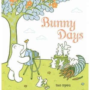
1. Tao Nyeu – Bunny Days (Dial)

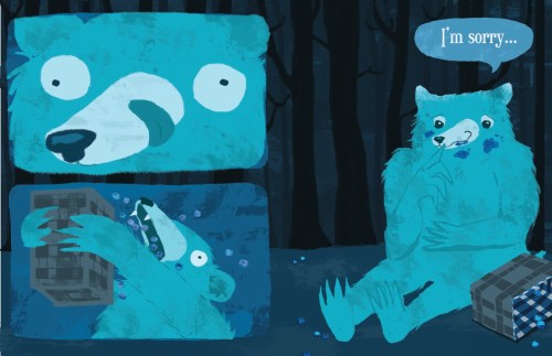
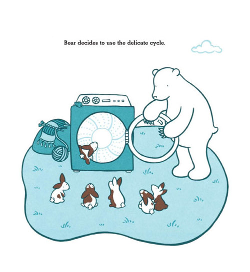
I was literally cooing and gasping with laughter aloud when I read this, as I couldn’t believe that a single book could be so adorable and disturbing at once!  In three parts, Mr. and Mrs. Goat find various ways to accidentally muddy/trap/maim a group of baby bunnies, and Bear comes to the rescue… with, um, interesting solutions.  Well-meaning Bear subjects the bunnies to the washing machine (and hangs them to dry!), a high-powered fan, and a sewing machine. AND THE BUNNIES ARE STILL CUTE! AND NOT DEAD!  Hilarious.

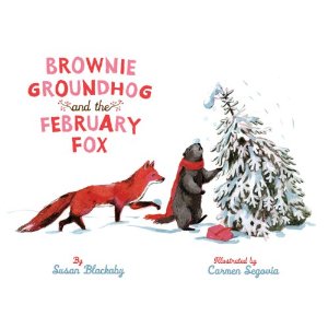
2.  Carmen Segovia – Brownie Groundhog and February Fox (Sterling)

This was one of my favorite designed books at the show.  I just love the wintery limited color palette with pops of red… reminds me of a modern version of classics like Mary Wore Her Red Dress. Plus, predator (Fox) and prey (Groundhog) become friends and share toast.  Aw.

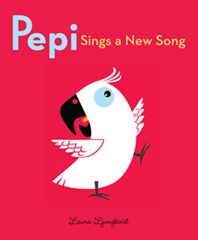
3.  Laura Ljungkvist – Pepi Sings A New Song (Beach Lane Books)

The creator of Follow The Line comes out with a new – totally fun – picture book!  Pepi the perpetually wide-eyed parrot puts a crazy spin on Twinkle Twinkle Little Star for his stargazing owner, Peter.  I always feel that word books and digital illustrations can go so easily BLAH, but Ljungkvist brings both to a whole new level.

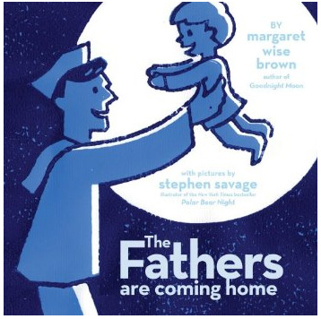
4.  Steven Savage  – The Fathers Are Coming Home (Margaret K. McElderry)

Sniffle alert!  Margaret Wise Brown’s post-humous bedtime story is simple and touching, bringing a tear to my eye as all the animal fathers (and one returning sailor) come home to their babies at night.  I’ve been enamored with Steven Savage’s atmospheric textured prints since he came into one of my illustration classes a few years ago, and as with Polar Bear Night, they’re once again the perfect complement.

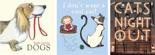
5.  It was raining cats and dogs this year!  I’m not normally a fan of “big black eyes” on characters, but Emma Dodd’s I Don’t Want A Cool Cat makes it work (plus, the book rocks). Emily Gravett’s Dogs is just that: all the breeds you can think of, animated with her classy British restraint. And one of my favorite original art pieces on the wall was Jon Klassen’s Cat’s Night Out… it’s a crying shame that the printed book had a polluted, sepia hue not in the art itself.  Klassen’s adorable little cats deserved more!

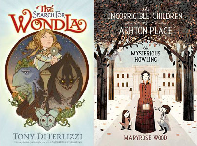
Despite what you may think, the show had more than picture books.  I haven’t read Tony DiTerlizzi’s The Search For Wondla (I’m woefully behind on my middle-grade and YA novels), but the design was spectacular. Color in the interior!  Gorgeous chapter openers!  I wanna do that!  The other book I must get my hands on is Jon Klassen’s The Incorrigible Children of Ashton Place Book 1: The Mysterious Howling.  Like A Series Of Unfortunate Events, it looks like something I’d love as a kid, but is sophisticated enough for adults.

Now that I’ve checked out all (okay, most…) of the books in the show, I definitely recommend that y’all do the same before it closes next week.  Go to there.